

THE CHALLENGE
ENCOUNTERED
A significant challenge I encountered was designing the different screens while ensuring clarity and comprehension of each section.
Balancing aesthetic appeal with functionality proved to be particularly challenging. However, by skillfully blending colors and functionality, I overcame this obstacle, ultimately creating a visually pleasing and highly functional interface for Taskube
WHY A
PROJECT
MANAGEMNET
APP?
According to the Standish Group's CHAOS Report, the percentage of failed or challenging projects has been relatively high over the years
Successful Projects - Only 29% of projects were completed on time, within budget, and with all planned features and functions.
Challenging Projects - 8% of projects were completed but with significant delays, cost overruns, or reduced scope.
Unsuccessful Projects - While 52% of projects were canceled, never completed, or never met the original goals and objectives.


CREATED A
COMPETITIVE
ANALYSIS
A competitive analysis was conducted to discern the most crucial and prevalent features in already successful project management apps. This strategic assessment aimed to identify key functionalities that resonate with users and contribute to the success of these platforms.
By analyzing competitors, I sought to gain insights into industry standards, user expectations, and emerging trends.

INTRODUCING
USER PERSONAS
TO THE
EQUATION
Why User Personas?
Personas where created during the UX stage of the project because they helped me empathize with users and make design decisions that align with their needs.
By personifying user characteristics and behaviors, I was able to develop features and functionalities tailored to their preferences, ultimately enhancing user satisfaction and adoption of the application.

THE
SUMMARIZED
UX FLOW
The User Experience flow provided a concise overview of how users would interact with the key screen groups within the platform.
It outlined the sequence of actions, decisions, and interactions that users would go through to achieve their goals efficiently and effectively, ensuring a seamless and user-centric experience.

THE
ONBOARDING
EXPERIENCE
New users and returning can easily access the platform from the landing page. The sign-up process prompts users to provide essential taskcube account details such as the email and password.
Additionally, users will have the opportunity to customize their interests and start working on their projects, ensuring an engaging experience.

THE
STYLE COLOUR
USED
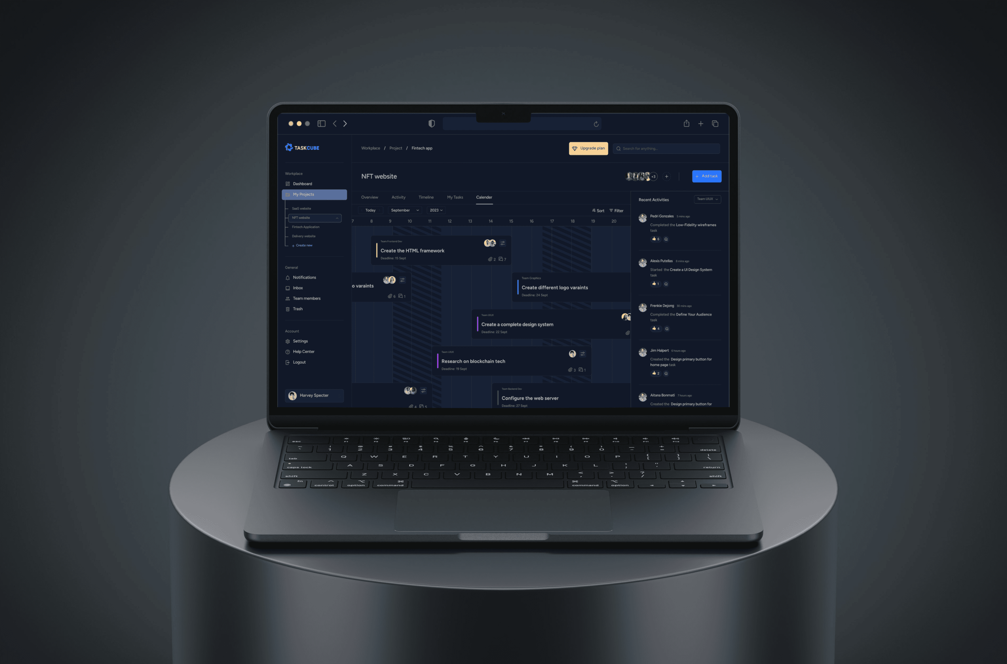
The chosen style colors for the project management application are strategically selected to enhance visual appeal and user experience.
The accent color (#1A66FF) highlights important elements, while the main text color (#B8BABE) ensures readability. The first background color (#111828) creates a sophisticated dark mode, while the second background color (#172136) adds depth and variation.
These colors combine to create a cohesive and customizable interface that prioritizes usability and aesthetics.

THE HOME PAGE,
WHAT CAPTIVATES
THE EYE AT FIRST
GLANCE
Crafting the homepage was a pivotal challenge as it serves as the initial encounter for users entering the website.
Recognizing the significance of first impressions, I aimed to ensure a captivating and memorable experience.
This involved a meticulous process of adding, removing, and iterating various sections to achieve an impressive and engaging introduction to the website.


NOVA

© 2024 ALVN. All Right Reserved.